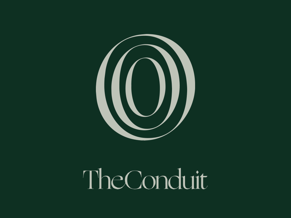
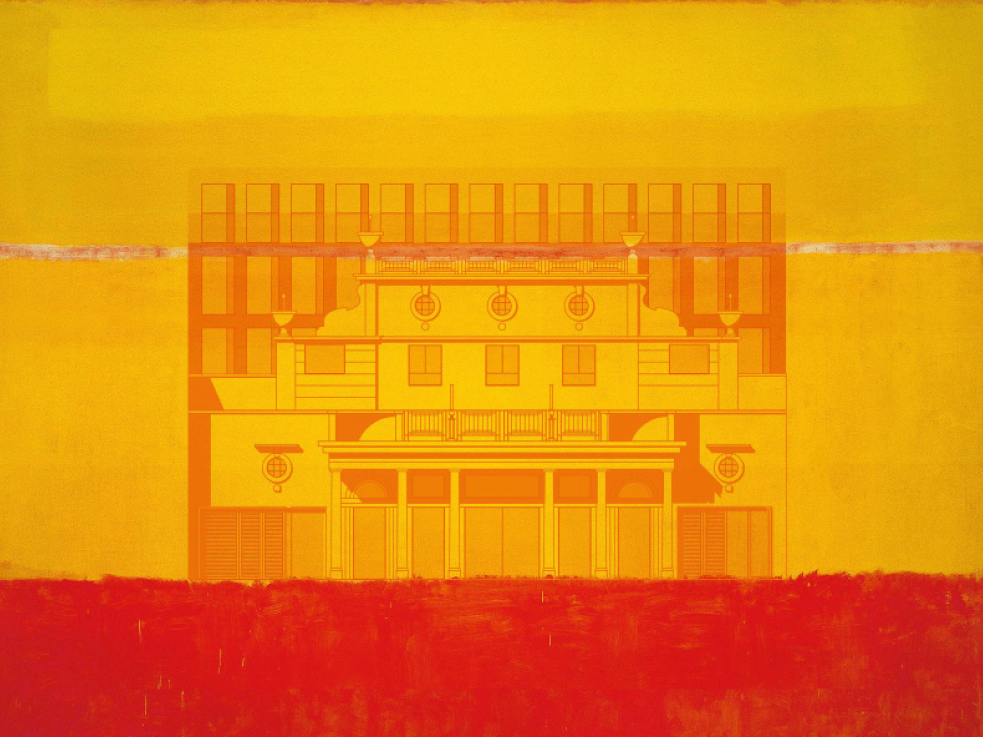
GAVIN VAN ROOD

Projects About hello@gavinvanrood.com

Native

Branding | Signage | Digital | Interiors

Native

Branding | Signage | Digital | Interiors

The UK's largest boutique ApartHotel chain

Taylor Wessing LLP

Corporate rebrand

Taylor Wessing LLP

Corporate rebrand

An international law firm


I played a central role in creating and rolling out a new brand identity for Taylor Wessing LLP, an international law firm. As part of an in-house design team appointed specifically for this project, I produced a modern design aesthetic featuring geometric forms, bold colours and landscape photography, taking inspiration from organic patterns found within nature.

Outputs included BTL advertising, B2B comms and brochures, sector specific iconography, PPT pitch templates, new photographic suites and international office re-branding.

Due to the pandemic, launch plans were shelved, and a micro-site was produced to celebrate the new brand, and function as a central resource for templates and assets.

The Line, NEOM

Brand identity

The Line, NEOM

Brand identity

A cognitive city under construction in Saudi Arabia, stretching 170 kilometers across mountain ranges, desert valleys and the Red Sea.

...


The Conduit

Brand identity

The Conduit

Brand identity

Based in Covent Garden, London, The Conduit private members' club is a collaborative community of entrepreneurs, investors, creatives, business leaders, activists, civil-society leaders and policymakers.


The contemporary event space, restaurant and rooftop bar, plays host to private dinners, conferences, screenings and cocktail receptions. Bringing together knowledge, networks and capital for sustained positive impact, to a collaborative community of people committed to creating a just, prosperous and sustainable future.

As interest in positive impact causes and membership numbers increase, The Conduit founders plan to extend club locations to various cities across the globe, requiring branded promotional material to gain capital from investors and attract new members.

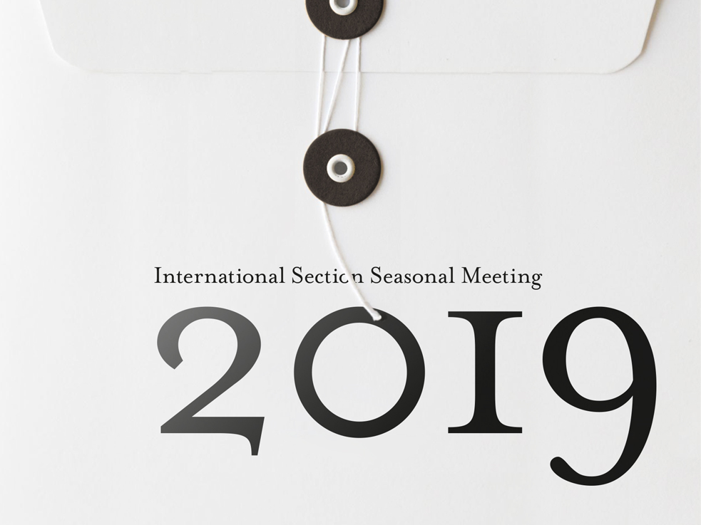
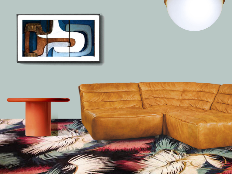
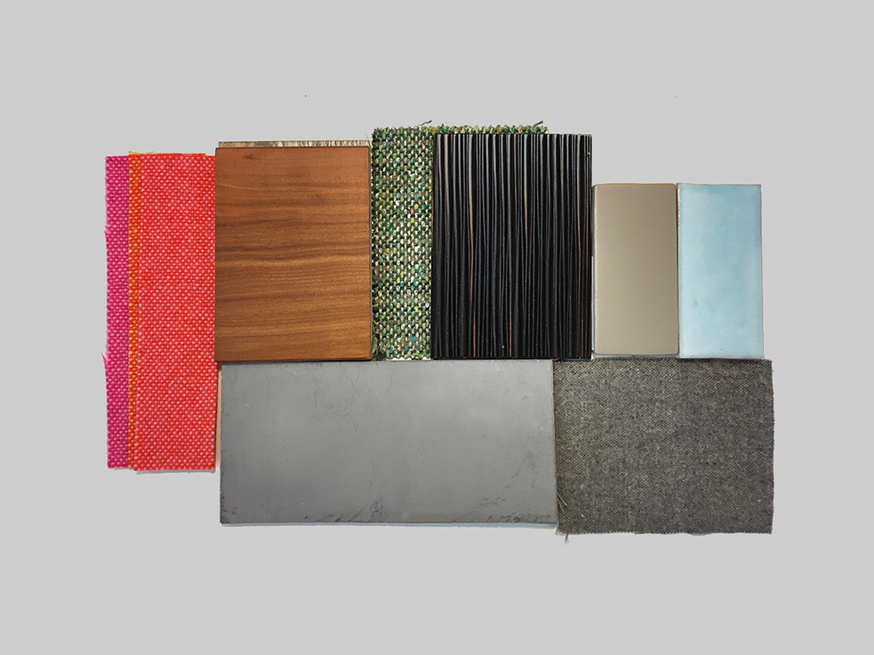
To that end, I refined the existing set of brand assets to produce a series of presentation decks, event invitations and location exterior signage, defining typeface hierarchies, introducing new iconography and photography, and creating a new Brand Book to house the brand refresh.

Tayma

Brand identity

Tayma

Brand identity

An ancient town in northern Saudi Arabia


Tayma is known for it’s shared, yet unique historical and archaeological importance, and is referenced in countless historical records for it’s trade, royalty and cultural influences. The smallest of three neighbouring ancient towns, Tayms's primary focal point is the a functioning water-well housed within a unique asymmetrical shape.

Working with a small collaborative creative team, this shape formed the basis of a wider pitch campaign, functioning as a brand lock-up and window device highlighting leisure photography, unique location details and rich topographic textures.

Muted tones synonymous with Tayma’s aesthetic contrast with strong location imagery and bold typography, while a unique dual-language logo was produced with the assistance of an illustrator specialising in Arabic typography.

Cultivate

Brand identity

Cultivate

Brand identity

TV production company


Born from a small team of creative writers and television concept creators, working for the esteemed and well established Objective Media Group (OMG), Cultivate was set up to operate as a uniquely independent enterprise.

Functioning within OMG, and seeking a unique brand identity to differentiate their business strategy and creative concepts, I worked closely with their founder, director and lead writer to create a very personal logo and brand identity with longevity and flexibility for mixed media usage, end-cards and other unforeseen applications.

Landing on a strong and clearly legible typographic logo, the simple ‘slit’ generated a playful and creative edge, allowing for multiple iterations and creative applications.A warm and confident colour palette, numerous vintage TV sets, and a suite of playful textures were selected, allowing for variations across multiple platforms and production themes, while the X device was created as a reference to collaboration, to be used as a stand alone brand element, or in conjunction with the main logo.

Costa Foundation

Brand refresh and promotional comms

Costa Foundation

Brand refresh and promotional comms

An independent charity helping alleviate poverty in their affiliated coffee-growing countries.


Update existing customer-facing materials and staff education packs, creating a new value-embodying logo and communicating the foundation’s benefits to its Fairtrade farmers.

By intelligent and creative use of logo, messaging and tone of voice, we illustrated the parallels between the growth of coffee plants and the beneficiaries. Specific location photography was selected to illustrate the positive impact on farmers’ communities – such as young people learning – made possible by public donations.

The campaign was seamlessly refreshed and updated; ensuring continued funding for the foundation’s work. The new messaging improved transparency and helped to highlight the foundation’s positive impacts. The indirect impact is a sustained positive boost to the Costa brand.

Knight Frank

Brochure design

Knight Frank

Brochure design

A residential and commercial property consultancy founded in London, operating across global markets.


Redesign and refresh their prestigious and long standing publication Private View, targeted at domestic and international high net-worth customers.

Our pitch-winning concept proposed a fresh approach to marketing property, by adding engaging, location-specific lifestyle content, and an editorial approach throughout the publication.

Understanding the investor market as largely international, we chose to incorporate the well-established, quintessentially British brand into our content, supported by a revised, modern, clean design.

Virgin Atlantic

Sales conference creative

Virgin Atlantic

Sales conference creative

One of the worlds most renowned, successful, and and forward thinking airlines.


Propose a creative concept for the 2013 annual sales conference, demonstrating the application across a defined set of deliverables, focusing on overcoming challenges.

Understanding the typical profile of sales people, and identifying the need to motivate and energise them for the year ahead, we anchored our creative direction around optimism, overcoming adversity and team work. Offering 2 distinct options,focusing on fantasy & aviation and extreme adventurers, the latter was selected as a strong bonding and motivational theme.

Realised through the use of high impactful photography across all comms, the use of evocative, motivational language and slogans also enhanced the theme of achievement through sustained, prepared group effort.

Gibraltar

UEFA application

Gibraltar

UEFA application

A British Overseas Territory on the Iberian peninsula


Support and promote the Gibraltar Football Association’s bid for membership of UEFA.

Recognising UEFA as 53 member organisation, we adopted a presumptuous campaign approach by labelling Gibraltar as 'Team 54', celebrating the nation's long standing enthusiasm for football, and unique rich cultural heritage.

Our campaign won the Grand Prix Overall Winner at the Drum Marketing Awards 2014, and in May 2013 51 nations voted ‘Yes’ to grant Gibraltar EUFA membership.

Gibraltar

Nation branding campaign

Gibraltar

Nation branding campaign

A British overseas territory on the Iberian peninsula


Create a nation-branding proposal with new brand suite for all government departments.

We proceed an adaptable brand identity to be applied across all government departments and agencies - including tourism, finance, education and maritime - while simultaneously safeguarding the nation’s brand identity to revive in it a proud sense of statehood, with a unified clear, and contemporary identity.

Our campaign won the Grand Prix Overall Winner at the Drum Marketing Awards 2014, and in May 2013 51 nations voted ‘Yes’ to grant Gibraltar EUFA membership.

Conran Interiors + Cuckooz Apartments

Interior design, art direction and original artwork

Conran Interiors + Cuckooz Apartments

Interior design, art direction and original artwork

A new residential development and Curzon cinema located in Old Street, London.


Produce a colour scheme and source furniture for 12 rental apartments of varying size, overseeing all aspects of interior design, procurement and installation.

I was commissioned by Cuckooz Apartments to lead the interior design of their newest and largest property, as part of a collaboration with well established procurement specialists Conran Interiors.

Retaining their playful & youthful brand aesthetic I created a sophisticated theme including unique mid-century pieces and high quality accent coloured furniture, to balance with the existing neutral marble interiors and white washed walls.

Launching in early 2019, this landmark property’s interior has bene widely praised, thus creating desirable homes for their target market.

FoodCycle

Brand refresh, website and animated movie

FoodCycle

Brand refresh, website and animated movie

UK based NPO charity focussed on reducing food poverty across the UK


Refresh the existing branding and build an easily managable website, to raise awareness and attract funds for targetteded growth plans.

Expanding on the playful direction of the brand, we refined the colour palette and graphic assets, brought a fresh look to the existing comms and introduced new promotional materials. Fully populated with vibrant branding, the flexible WordPress template featured an donation facility, social media links, enabling the client to showcase their achievements and update content without assistance.

Funding was granted from the government department Nesta, donations increased dramatically through their new online presence, and the number of FoodCycle hubs increased nationwide.

The New York State Bar Association

Annual event promotions

The New York State Bar Association

Annual event promotions

Pitch creative

Paul Corbitt

Brand identity

Paul Corbitt

Brand identity

Sydney based senior stylist and salon owner


Create a fresh and distinct brand identity, with adaptable scope for future business development and advertising.

Preempting the imminent launch of his first salon, Paul wanted to retain his client base and discreetly soft-launch his new venture. Capitalising on his award-wining career at Tony & Guy, I carefully selected an image that reflected his success, with a hint of glamour and femininity - literally flowing through his name. The ‘locks of hair’ worked as an obvious nod to hairdressing, eliminating the need to state the obvious, and allow his name to become the brand.

The format allowed for multiple, unknown future applications, and Paul continues to use the original hero piece across all promotional materials.

Sink the Pink

Brand identity

Sink the Pink

Logo design

LGBTQ+ club promoters and event organisers


Part of East London's underground scene since 2009, these club promoters have established Sink The Pink as key players in the modern queer movement, organising and managing festivals (Mighty Hoopla), club nights and events, collaborating with the likes of Sony PlayStation, YSL and Stoli Vodka.

I was briefed to create a fresh and recognisable logo to feature on promotional materials, stage sets and merchandise, reflecting a self proclaimed style as vibrant, trashy, fun, frivolous and unapologetic.

Relying heavily on colourful neon characters synonymous with night clubs and a street level aesthetic, I created a logo that sucessfully reflects the diversity of the promoters and celebrates the club scene.

Unique and eclectic, the logo has adapted well to large-scale applications for events and performances such as The Mighty Hoopla, London's Troxy, Bestival, Glastonbury and Selfridges.

Hotel Viajó

Interior design suite and lobby concept

Hotel Viajó

Interior design suite and lobby concept


Capitalising on these inherited design attributes, and with the help of some well considered architectural modifications, Hotel Viajó must take influence from this celebrated period of interior design to create a sense of modernity, progression, comfort and serenity.

Delicately placing Hotel Viajó into the 21st century, a mixed use of original and modern pieces is encouraged, and hidden technology must work seamlessly with atypical materials, textures, lighting, furniture and layout.

The target audience of 35-50 year will have exposure to the abundant luxury available in 2018, expecting the highest quality design and finishes, whilst taking pleasure in the element of surprise and joy.

Clerkenwell offers a more sedate guest experience, surrounded by history, with an abundance of restaurant and bar options, tucked away from the hustle and bustle of modern London.

Studio apartment

Interior design concept

Studio apartment

Interior design concept


My client's well connected London studio apartment meets his residential and commercial requirements, functioning as a calm sanctuary and a conveniently located home studio.

A collector of unique artefacts and personal items, and an eclectic wardrobe (catering for hikes, conferences, leisure and work), David requires adaptable and functional storage space to display or store these objects, avoiding a ‘clinical gallery space’ atmosphere.

The interior must maximise the limited space, natural light, balcony access & views, by creating practical zones, comfortable spaces to relax, read, cook and sleep, with uncluttered ample storage space, practical surfaces.

Respecting the humble 1970’s planning, design and architecture, the kitchen and bathroom should have functional fixtures and fittings, be as spacious as possible, while minimising impact on the overall layout.

Chloe Rood

Brand identity and wesbite

Chloe Rood

Brand identity and wesbite

An independent set and event designer


Facing an urgent and rapid turnaround, a new website was required to display a large collection of projects, in preparation for a post-lockdown business strategy and brand launch.

With a brief to ensure the photography to take centerstage, I created a carousel for the landing page, a structured grid throughout, and project pages that adopted a more unique mood-board style layout. Allowing users to easily navigate the site and be enticed by the projects, short paragraph descriptions with an editorial serif typeface gave weight to the high profile client base. Whereas each

The confident yet discreet new logo was knocked back, bringing the imagery to the forefront, and an alternative monogram logo was created to function as a stamp, for social media, or was a watermark.

This brief gave me the opportunity to learn new online website design tools, of which I am now fully competent.

Dusty Baps

Brand identity

Dusty Baps

Brand identity

Restaurant concept

Pioneer Point

Brand identity, website, art direction and signage

Pioneer Point

Brand identity, website, art direction and signage

A landmark residential tower in East London


Launch the building into the lettings market, and drive high levels of demand and awareness.

I delivered a creative direction to give the building a contemporary iconic identity, and create a website that would cement the building as a key destination for young professional renters. A lifestyle and location photoshoot captured the aspirations of high rise living, capitalising on the impressive City views and modern interiors. Prior to launch, temporary on-site promotional hoardings helped to ramp up enquiries, while permanent signage was prepared for installation.

The design concept and photography were rolled out across multiple integrated campaigns, social and onsite promotional materials, plus a highly visual and responsive website was produced.

Meli Melo

Packaging, social, quarterly magazines and brochures

Meli Melo

Packaging, social, quarterly magazines and brochures

London based boutique fashion brand


Boutique fashion brand, Meli Melo required help to refine their customer-facing visual personality, streamline their internal comms, and develop long-term creative concepts.

I produced a new quarterly magazine, social posts, new product packaging, multiple brochures, seasonal look-books, and brand guidelines. Internal collateral included new briefing structures, sign-off processes, digital template suites, and photoshoot guidelines.

These measures improved internal communication, freeing up more time for design time spent on design. Long-term campaigns flourished, with increased e-commerce activity running smoothly. Seasonal changes became slicker, social media language was modernised and brand consistency improved.


melimelo

Roman Caban

Brand identity, website and promotions

Roman Caban

Brand identity, website and promotions

Personal Trainer and Sports Therapist


Create a brand identity, marketing comms and an online presence to launch a business and secure new clients.

To promote my client as professional, established and qualified, the creative direction focused on strength and agility by incorporating an iconic Centurion’s helmet as the brand mark, thus creating a memorable link to the client’s name.Considering the target audience, an one page website was produced as a platform to promote the clients’ extensive qualifications and client testimonials, showcase location photography, and feature training videos.

The resulting brand presence and promotions generated a marked increase in Roman’s client base, enabling more social working hours and the introduction of group training programmes.

Annique

Brand identity, art direction and packaging

Annique

Brand identity, art direction and packaging

Jazz singer and songwriter